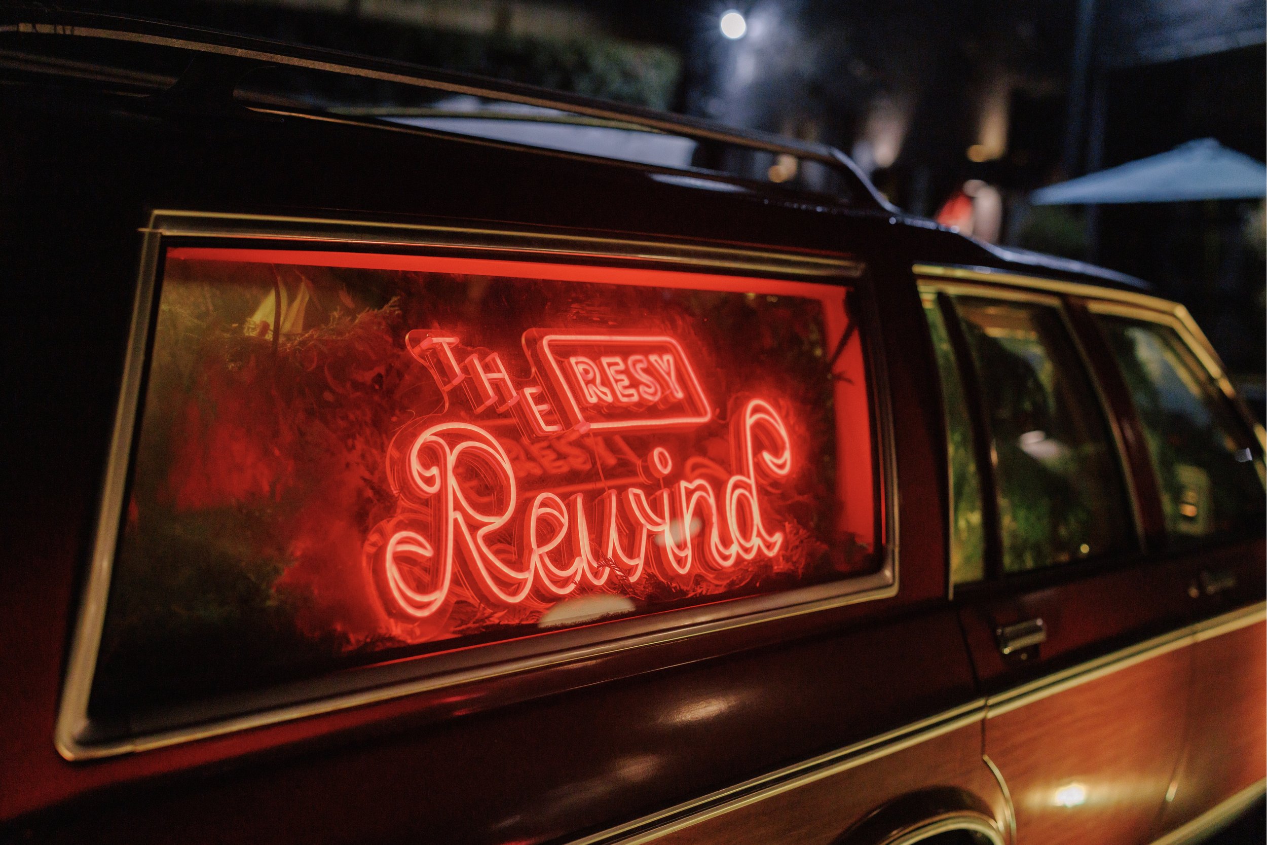
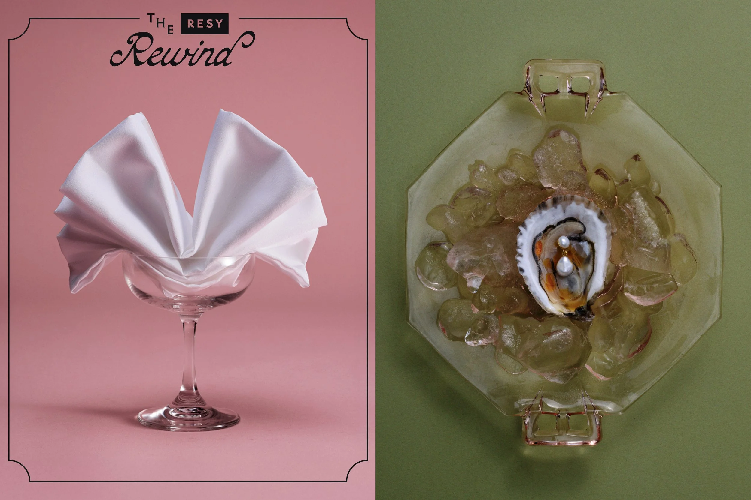
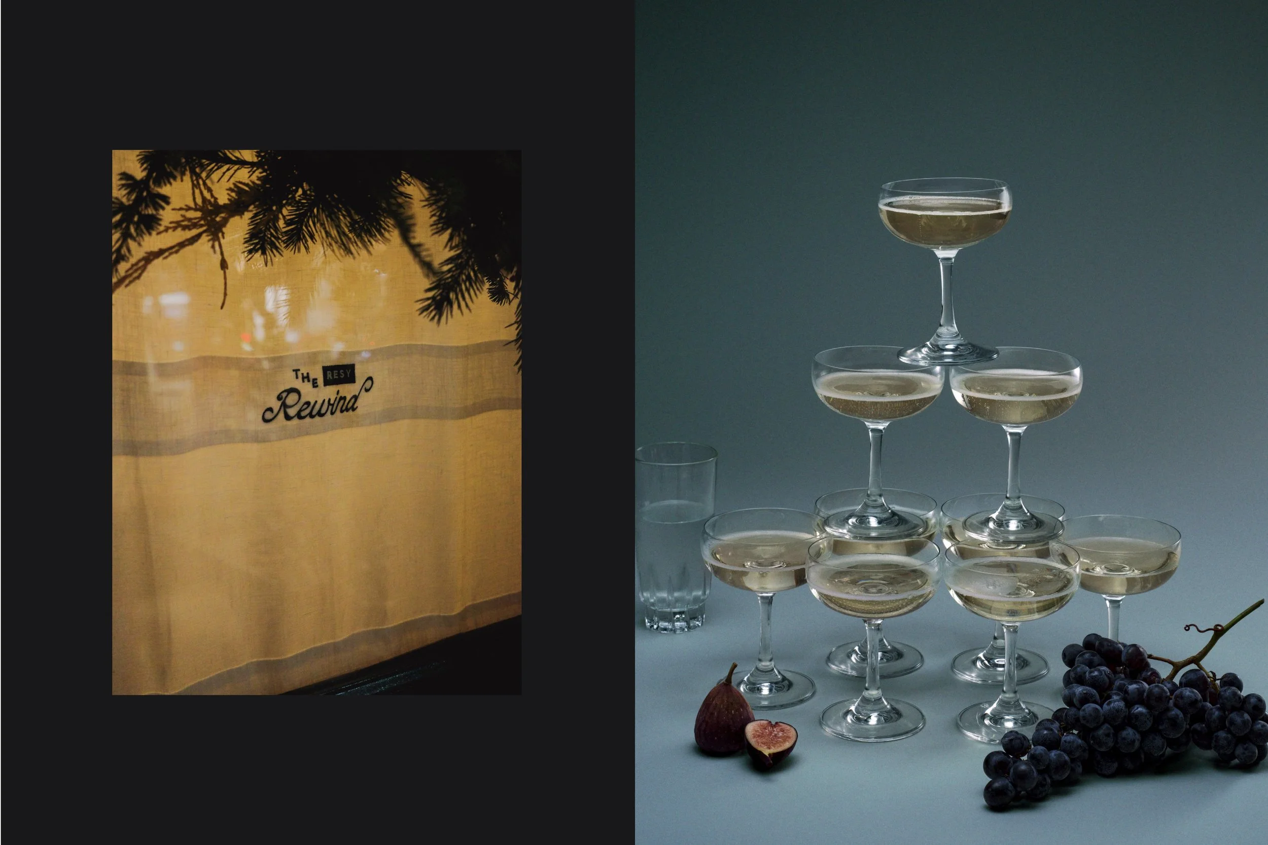
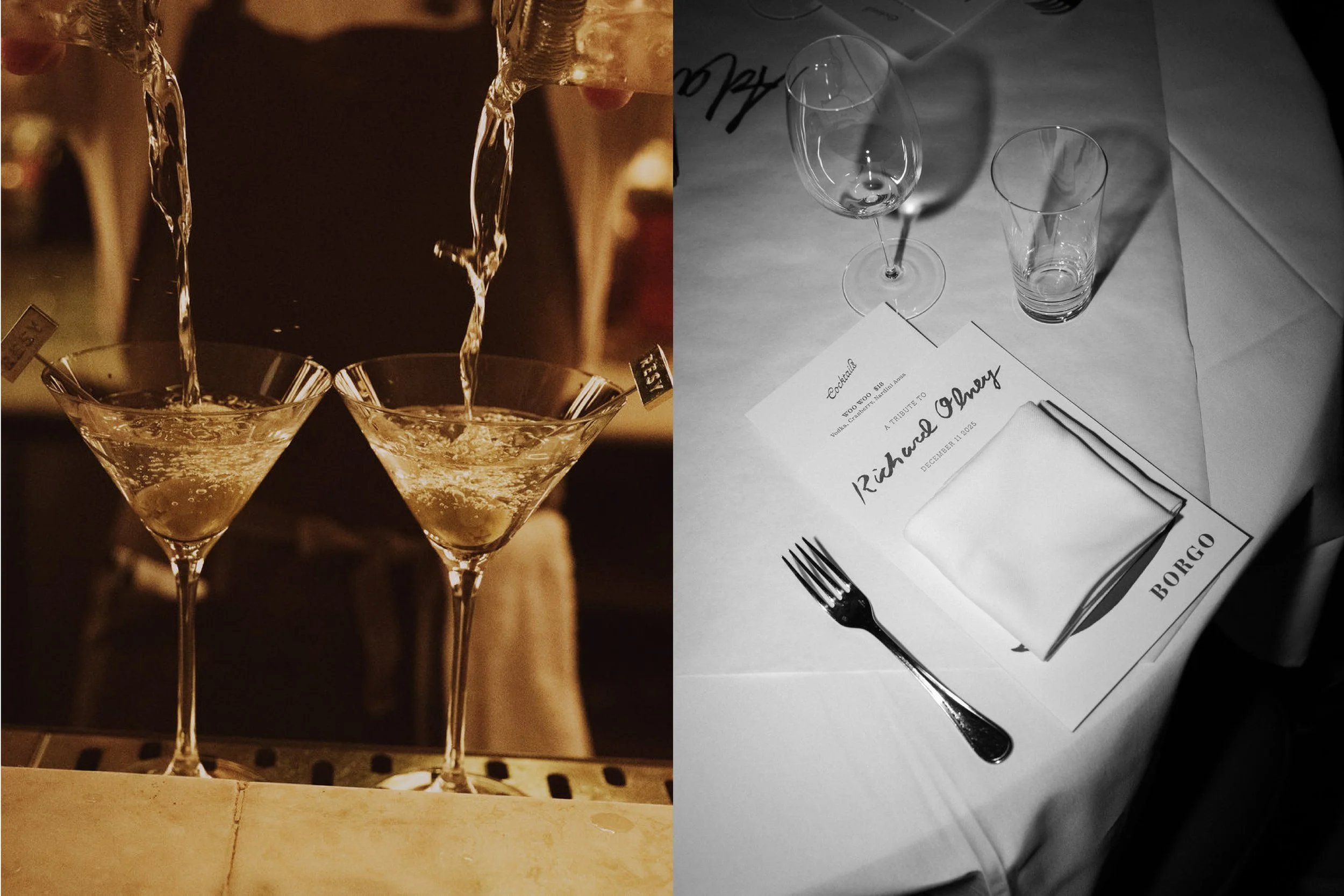
The Resy Rewind
Multiple Cities, USA
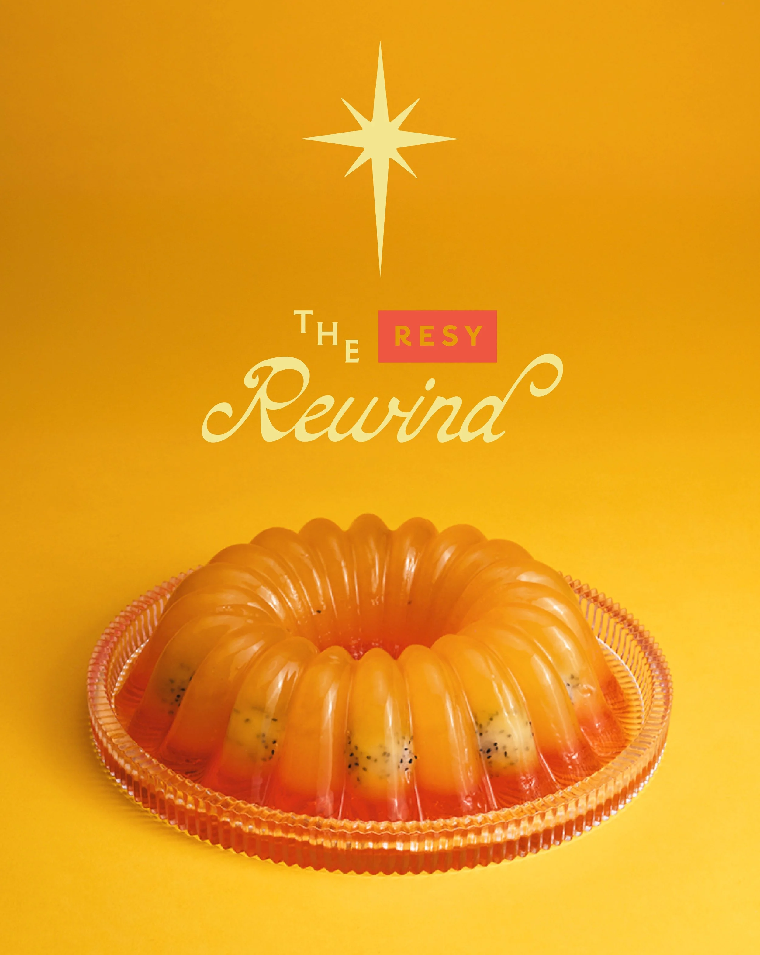
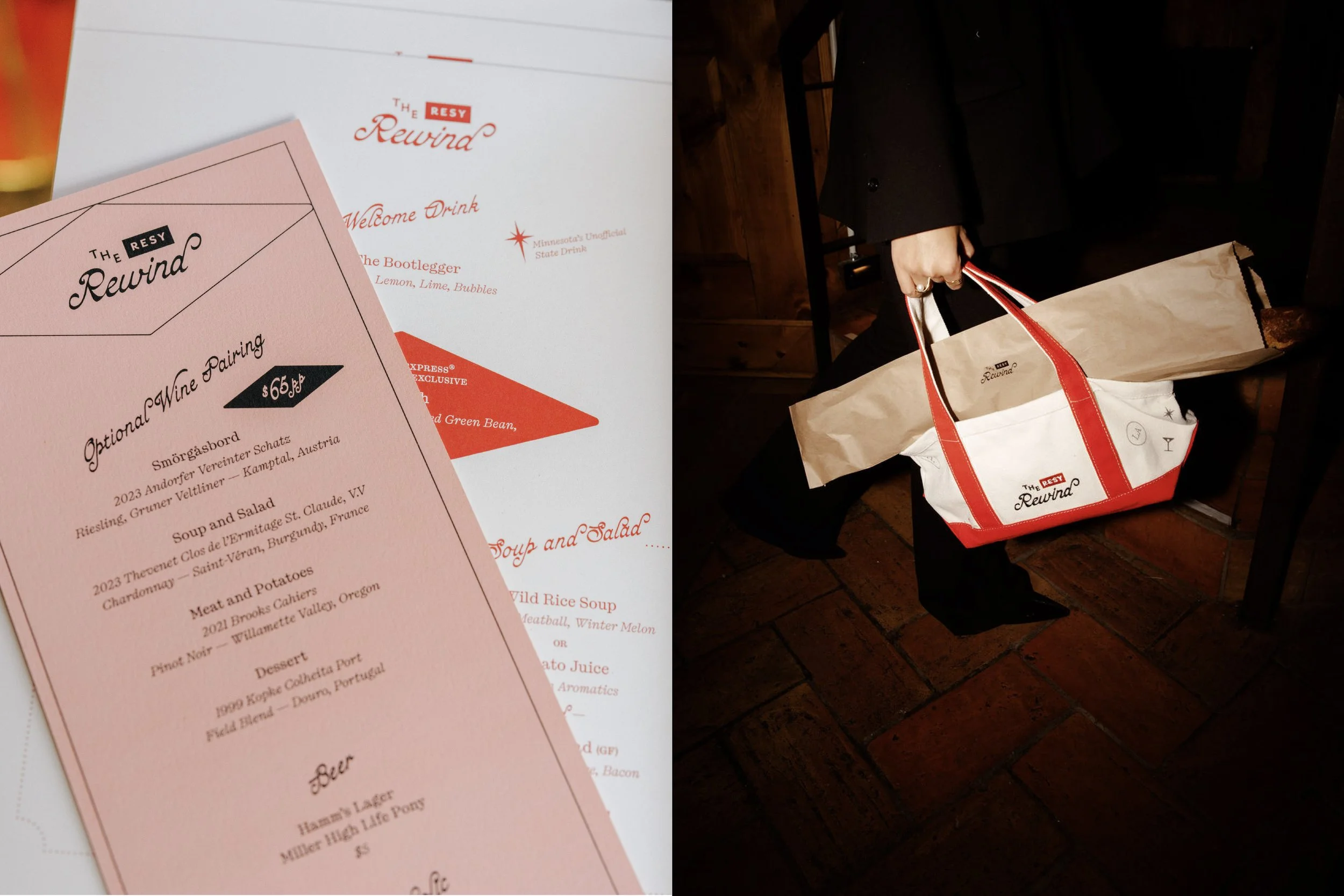
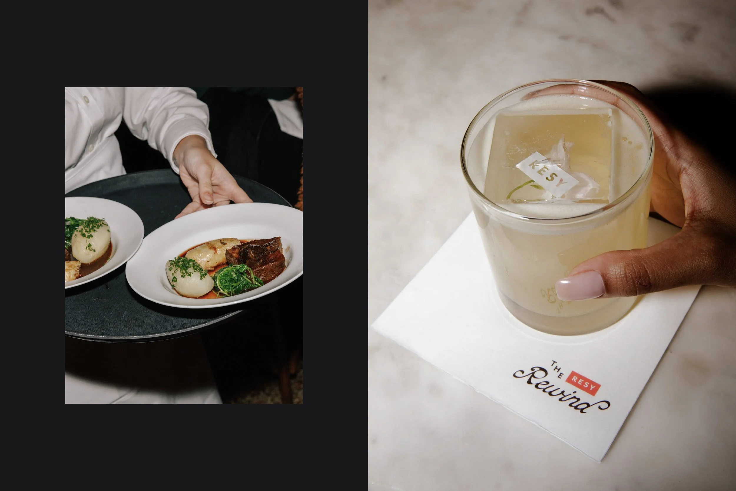
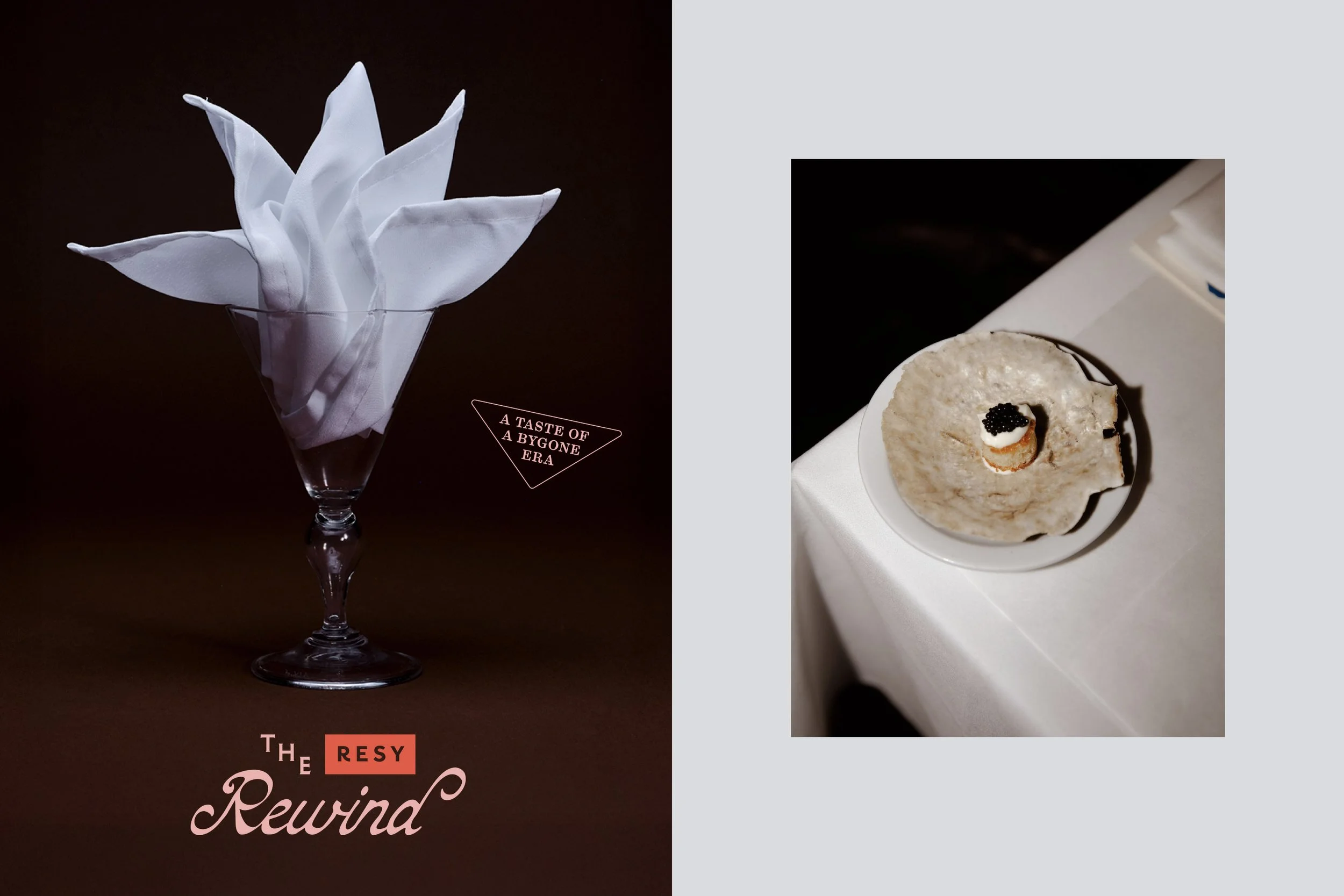
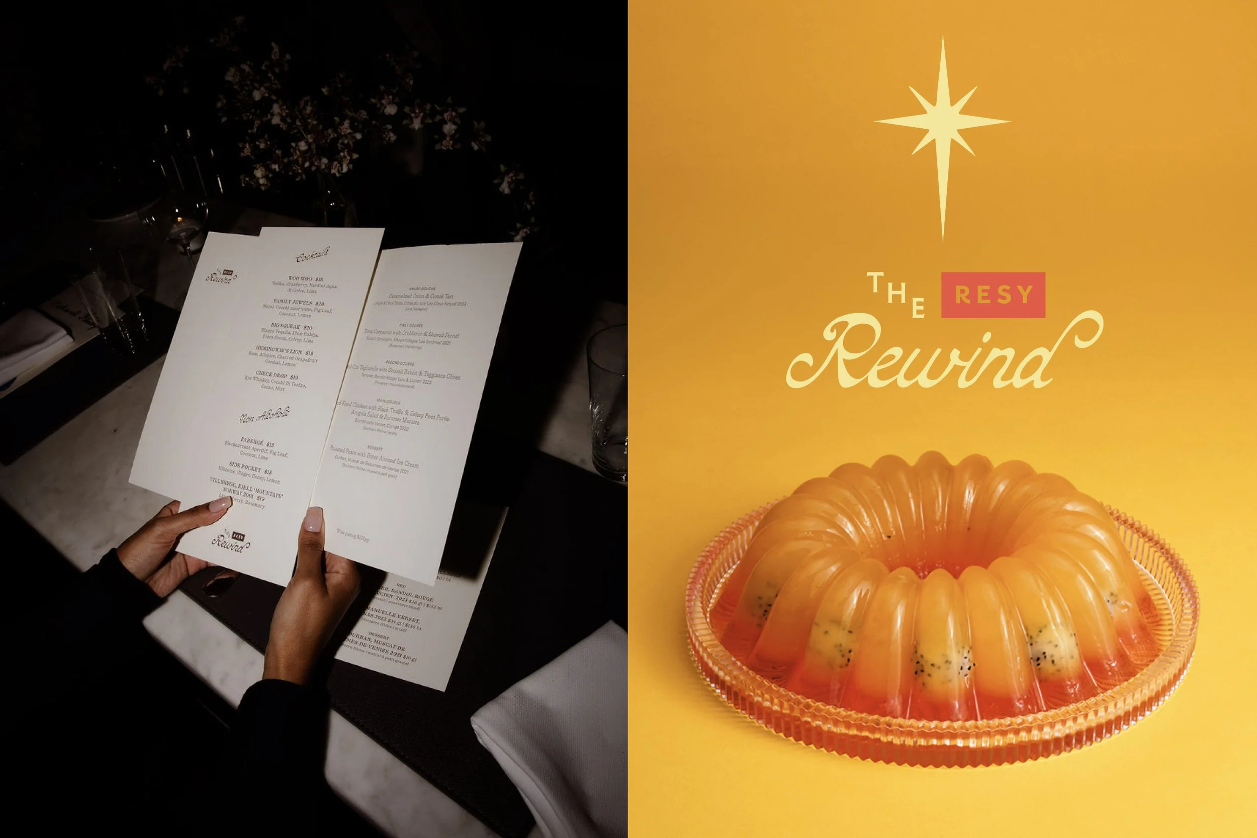
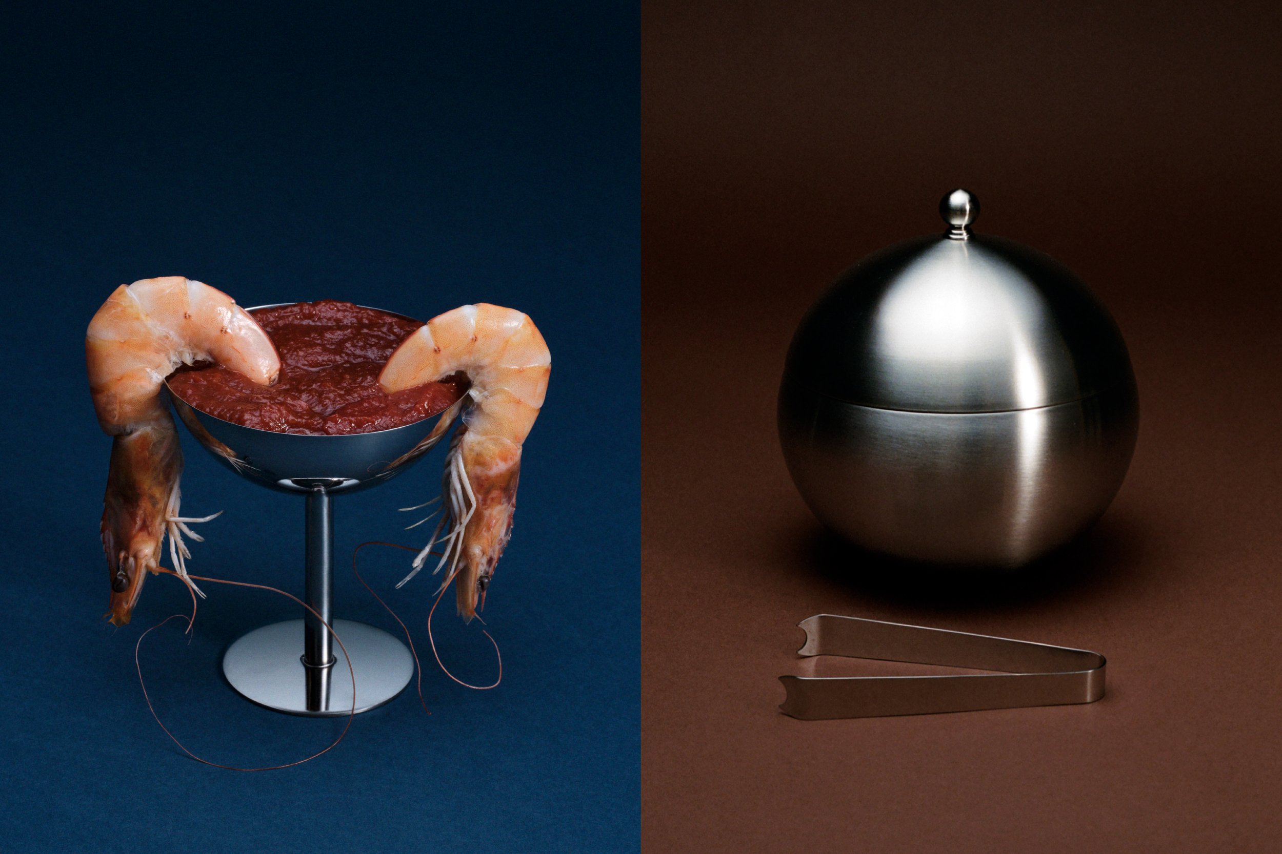
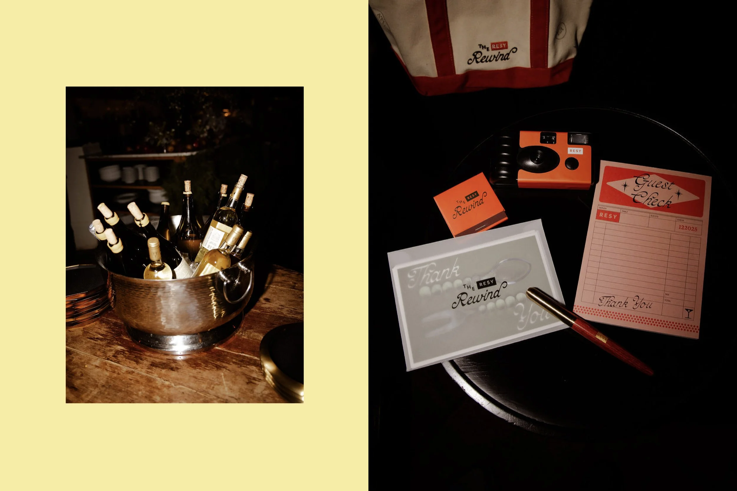
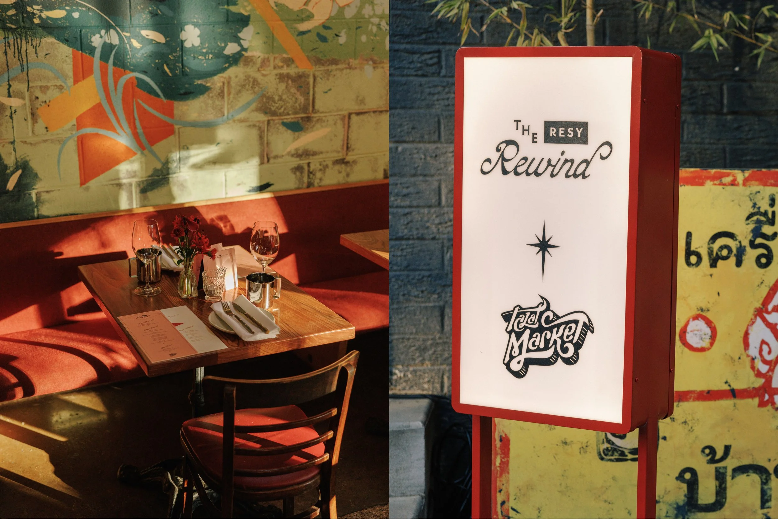
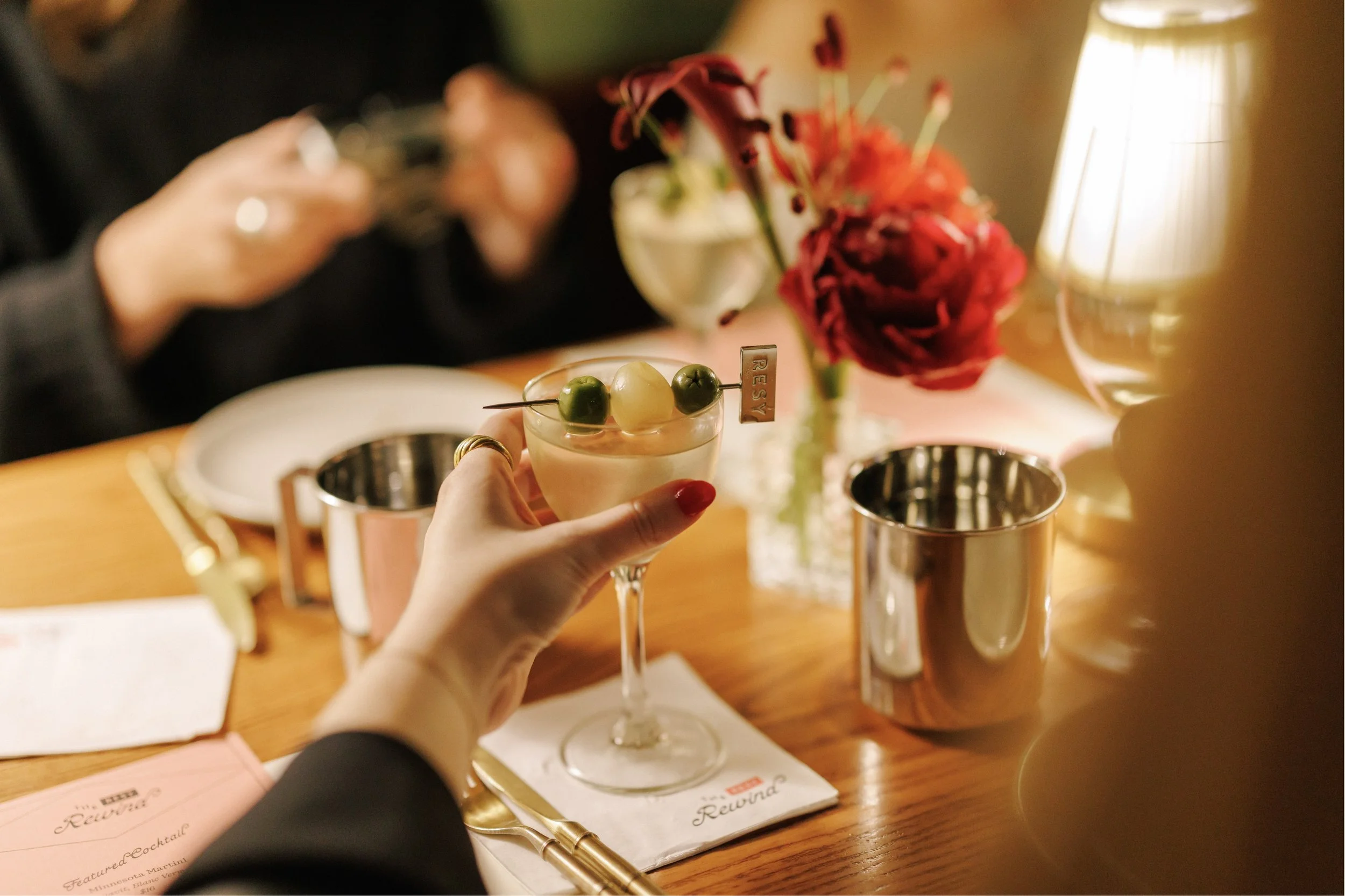
For The Resy Rewind, we developed an identity inspired by the spirit of the classic supper club, where dining was shaped as much by atmosphere and ritual as by the meal itself. Drawing on the social energy of shared tables, lingering courses, and late-night conversation, the concept treats nostalgia as emotion rather than pastiche, framing dining as memory, spectacle, and connection.
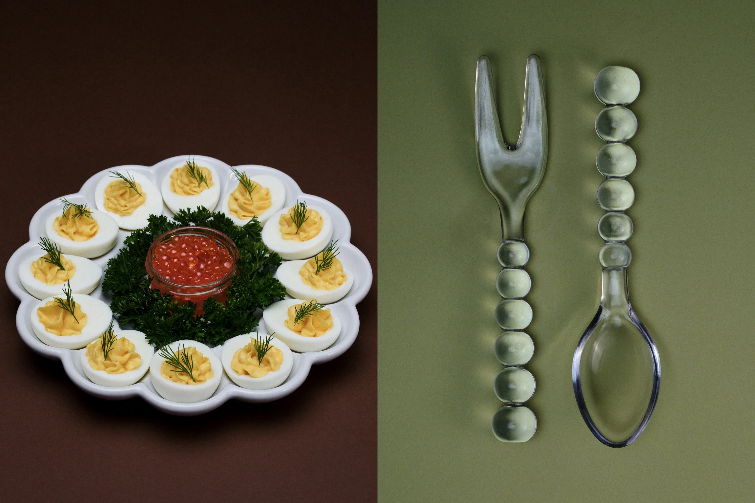
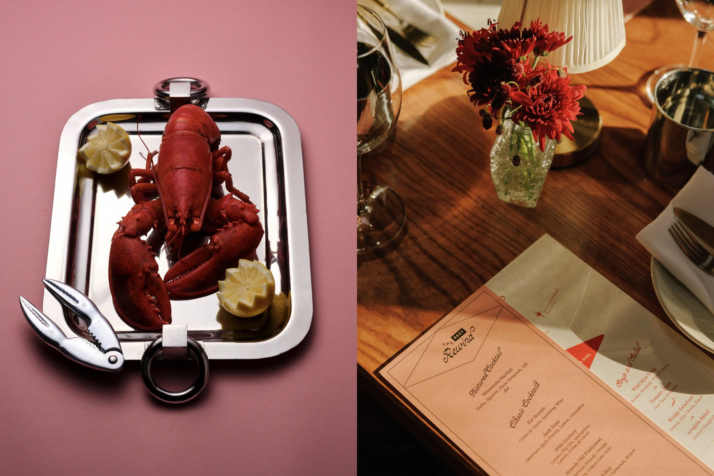
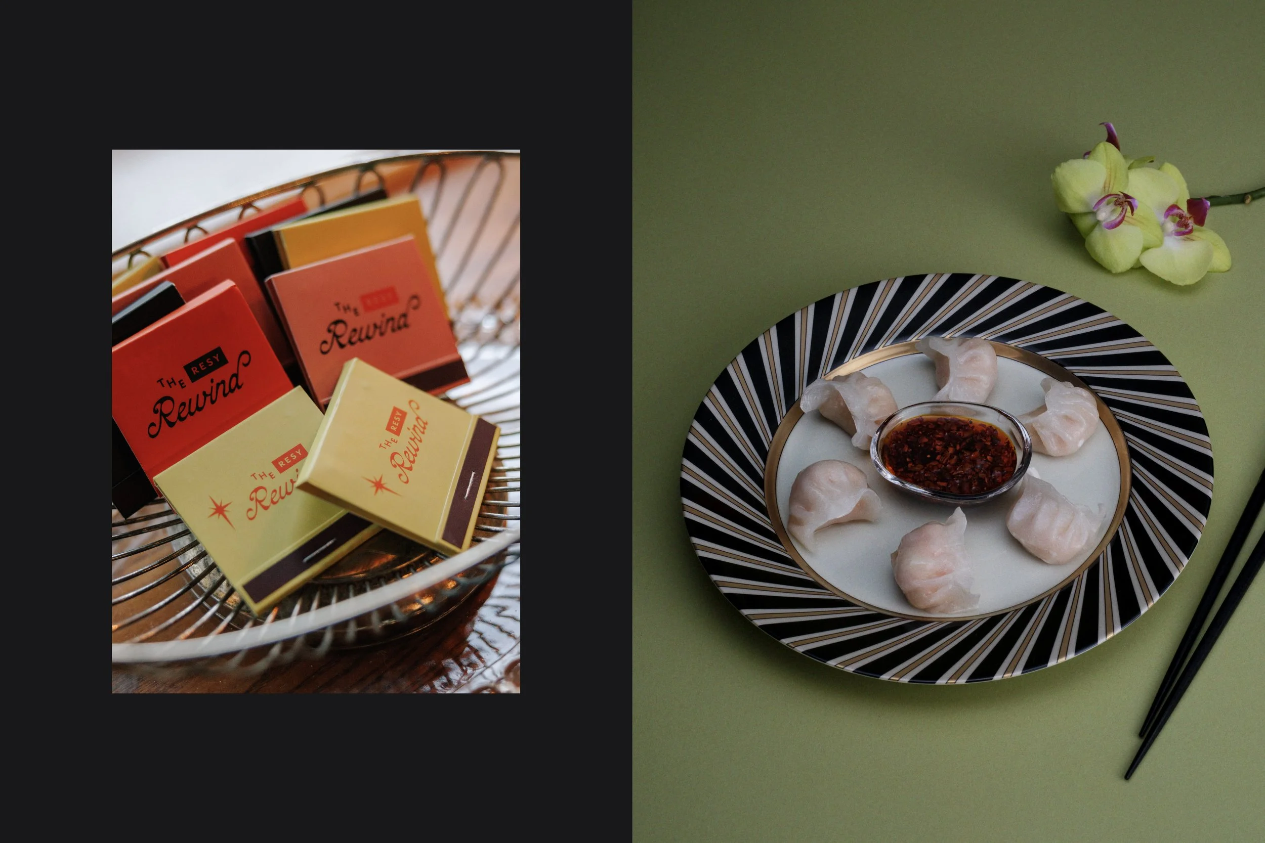
The visual language combines retro-inspired typography with confident iconography, art-deco-informed geometry, and bold, high-contrast compositions. A palette of salmon pink and butter yellow, anchored by black and Resy red, gives the system a playful yet striking edge. This graphic sensibility carries through to our art-directed photo campaign, where still-life portraits of iconic dishes from across the decades of the 1900s are composed with care and restraint, capturing food as both cultural memory and visual artifact.
event ideation, production and curation
Care of Chan
brand
Creative Direction by Polonsky & Friends, Art Direction by Anna Polonsky, Graphic Design by Jenna Ory
photo campaign
Photography by Lucia Bell Epstein, Food Styling by Pearl Jones, Prop Styling by Gözde Eker